
7 Costly Power BI Dashboard Mistakes That Are Costing You Executive Trust
Introduction
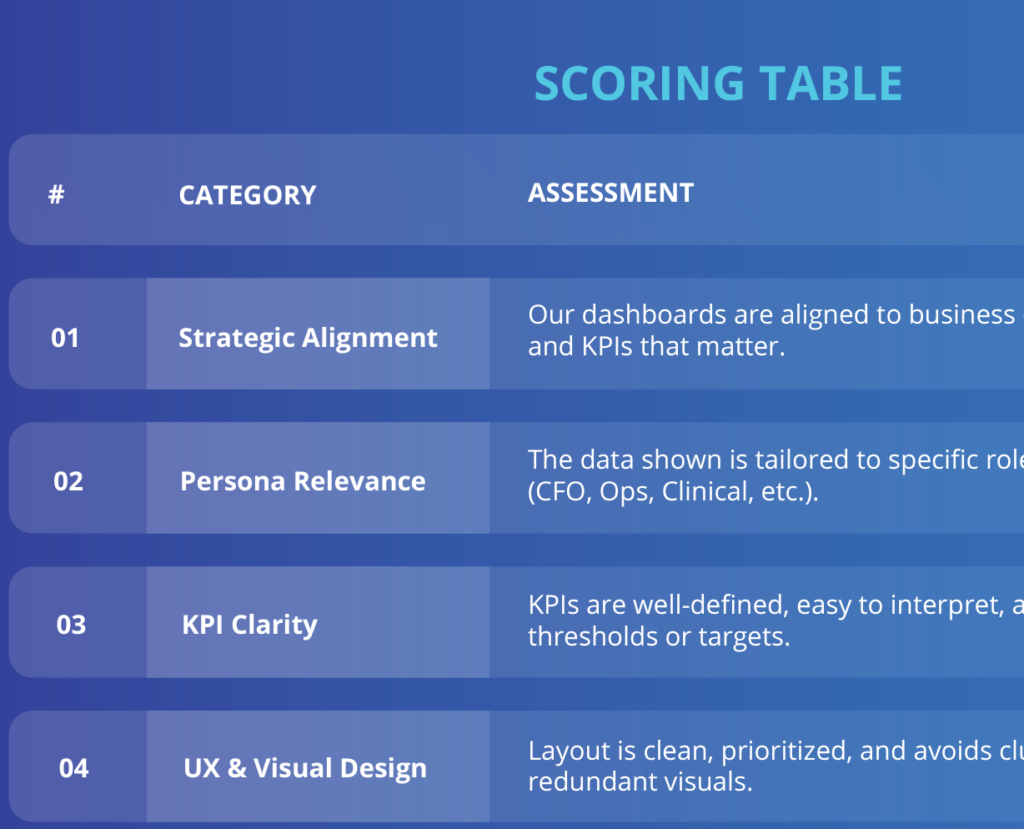
Your Power BI dashboard isn’t just a report — it’s your executive team’s window into the business. But if that window is foggy, cluttered, or inconsistent, it erodes trust fast. Even the best data strategy can fall apart if the delivery fails to inspire confidence.
In this article, we’ll unpack the 7 most common dashboard design and data strategy mistakes that silently sabotage leadership trust — and how to fix each one.
Power BI Dashboard Mistake #1: Overloading the Dashboard with Too Much Data
Why it’s a problem:
Executives are busy. A cluttered dashboard full of charts, tables, and KPIs creates noise — not insight.
Fix:
Use the 80/20 rule. Highlight the 20% of metrics that drive 80% of decisions. Keep supporting data in drill-throughs.
Bonus Tip:
Use bookmarks and tabs to create a clean hierarchy and progressive disclosure.
Power BI Dashboard Mistake #2: Misaligned KPIs With Business Goals
Why it’s a problem:
If your KPIs don’t match strategic goals, it’s hard for leadership to connect the dashboard with results.
Fix:
Start with the business strategy. Every visual should answer: “Does this help move a strategic needle?”
Example:
Swap vanity metrics like total users with actionable ones like MRR growth rate.
Power BI Dashboard Mistake #3: Inconsistent or Confusing Visual Design
Why it’s a problem:
Executives won’t spend time learning your dashboard. Bad UX = bad adoption.
Fix:
Stick to a consistent color palette, fonts, and layout grid. Use clear titles, labels, and legends.
Pro Tip:
Use tooltips and place KPIs in the same position across pages.
Power BI Dashboard Mistake #4: Failing to Segment Data for Different Audiences
Why it’s a problem:
A one-size-fits-all dashboard won’t meet the unique needs of operations, finance, and C-level execs.
Fix:
Design role-specific views or dashboards using row-level security and audience filtering.
Power BI Dashboard Mistake #5: Slow Performance or Load Time
Why it’s a problem:
Executives expect speed. A dashboard that takes 10+ seconds to load screams amateur.
Fix:
- Optimize your data model
- Use aggregations
- Limit visuals per page
Tool:
Use DAX Studio or Power BI Performance Analyzer.
Power BI Dashboard Mistake #6: Lack of Narrative or Context
Why it’s a problem:
Data without a story feels meaningless. Executives want answers, not just visuals.
Fix:
- Add commentary or summaries
- Use dynamic text boxes to show key insights
- Frame visuals with strategic questions
Power BI Dashboard Mistake #7: No Clear CTA or Next Step
Why it’s a problem:
Even the best insights are wasted if they don’t lead to action.
Fix:
Every dashboard should answer: “What should we do next?” Add callouts, alerts, or action buttons.
How to Fix These Mistakes in Real Life
Fixing these mistakes doesn’t mean starting from scratch. Start with a dashboard audit to assess gaps in clarity, alignment, and performance.
Tools like the Power BI Performance Analyzer or DAX Studio can help you evaluate performance bottlenecks.
Don’t forget to involve stakeholders in the process. Conduct a 15-minute feedback loop with decision-makers to validate which KPIs truly matter to them.
Final Thoughts
Fixing these mistakes isn’t just about good design — it’s about driving trust, credibility, and results. Your dashboard should be a decision-making tool, not just a reporting mechanism.
Want help auditing your Power BI dashboards?
👉 Get your FREE Dashboard Scorecard here