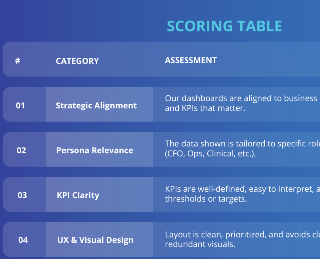
Power BI Dashboard for Construction Delay Analysis: A Step-by-Step Guide
Delays in construction projects are not just costly—they’re disruptive to teams, budgets, and reputations. But what if we could spot delays before they happen?
This isn’t fiction. This is the reality that Power BI dashboards make possible. In this in-depth guide, you’ll learn how to use Power BI to create a construction delay dashboard—from understanding business needs, mapping out KPIs, connecting data, and designing insightful visuals that actually change how people work on site.
Step 1: Define the Vision and Business Objectives
Behind every dashboard is a business question. Before you open Power BI, ask: what are we trying to achieve?
Vision:
Give project managers and executives real-time clarity on delay risk—so they can act, not react.
Business Objectives:
- Improve on-time project completion by 20%
- Increase visibility into delay causes
- Reduce cost overruns due to avoidable delays
- Foster accountability across vendors and subcontractors
Real-World Insight:
“Our CFO was tired of hearing about delays after they happened. With our new dashboard, he sees upcoming risks before they hit the balance sheet.”
Step 2: Identify Key Business Value Drivers
Dashboards that focus on what matters most get used. Those that don’t? Ignored.
Business Value Drivers:
- Productivity: Keep crews and machines moving
- Forecast Accuracy: Real-time deviation from baseline
- Resource Coordination: Avoid delivery lags and idle time
KPIs to Monitor:
- Planned vs. Actual Progress (% by milestone)
- Average Delay per Task (days)
- % Tasks Behind Schedule
- Delay Reason Frequency (Weather, Labor, Materials)
- Subcontractor Delay Index

Step 3: Understand the End User (Persona-Based Design)
The end-user isn’t a data scientist. It’s the field operations manager, the PM, or the COO. They need clarity.
Persona Snapshot: Site Manager
- Pain: Too much time buried in spreadsheets
- Need: Fast answers to “what’s at risk?”
- Success: Complete weekly reviews in under 15 minutes
Suggested Layout (by tabs):
- Executive Summary – Overall delay health, KPIs, alerts
- Timeline Tracker – Gantt view, critical path, flags
- Root Cause Analysis – Filter delays by region, reason, vendor
- Actions – Delay approvals, mitigation steps, handoffs

Step 4: Get the Right Data Flowing
A dashboard is only as good as the data behind it.
Data Sources:
- Scheduling Tools: MS Project / Primavera P6
- Field Reports: Procore, Smartsheet, Excel logs
- Time Sheets: Clockify, contractor portals
- Weather: NOAA API or Visual Crossing
- Material Tracking: Manual logs or delivery apps
Tools:
- Power Query for ETL
- Power BI Dataflows for reusability
- SQL Server / SharePoint integration
[Insert flowchart: Data → Clean → Merge → Calculate → Visualize]
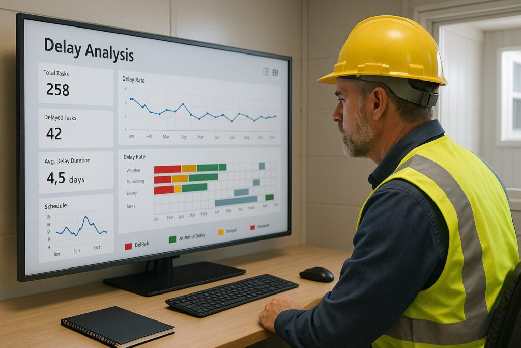
Step 5: Analyze Delay Causes with DAX
Measures to Create:
Delay Days = DATEDIFF(‘Schedule'[Planned End], ‘Schedule'[Actual End], DAY)
Delay % = DIVIDE([Delay Days], ‘Schedule'[Duration])
Visualizations to Use:
- Gantt Chart: Overview of schedule
- Stacked Column: Delay by reason
- Matrix Table: Subcontractor delay heatmap
- Trend Lines: Delay trends by week/month
Bonus Tip:
Use Bookmarks to toggle between overview vs detail views.
Step 6: Automate Alerts & Drive Action
Don’t make users hunt for problems—surface them proactively.
Automation Ideas:
- Delay threshold triggers email via Power Automate
- Weekly summary PDF delivered to inbox
- “Tasks at Risk This Week” widget on homepage
🖼️ [Insert flowchart: Dashboard Alert → Power Automate → Email Action]
Case Study: From Reactive to Proactive — A Real Client Story
Client: Mid-Sized Commercial Construction Firm
Problem:
- 3 out of 5 projects behind schedule every quarter
- Field teams didn’t communicate delays until it was too late
Our Solution:
- Designed a dashboard that combined Procore, NOAA Weather, and manual Excel logs
- Created a delay index and weekly executive summary
- Setup Power Automate to alert teams when delay risk >3 days
Results in 4 Months:
- 27% increase in on-time milestones
- 60% fewer delay disputes between GC and subcontractors
- CFO got delay risk forecasts before payment schedules were finalized
What You Can Learn:
✅ Always start with the end-user in mind
✅ Connect just 3–4 key systems (don’t overbuild)
✅ Start small, then expand (but document as you go)
Download This Template to Get Started Today
Click here to download our Construction Delay Analysis Excel Template
Includes:
- Delay log & categories
- Timeline visualizer
- KPI summary sheet
- Conditional formatting
- Action planning section
[Insert screenshot of Excel template with branded visuals]
Helpful Links & Tools
- Power BI Desktop
- Power Automate
- Visual Crossing Weather API
- Procore Construction Software
- DAX Formatter
Final Thoughts: Don’t Wait for Delay Reports — Predict Them
Construction delay dashboards aren’t just about pretty charts. They’re about giving your team early warning signals so you can save time, money, and reputation. With Power BI, that vision is fully achievable—even if you’re just starting out.
Need help building your delay dashboard? Schedule a free strategy session with Nexus Dataworks